Eclectic Minimalism Living Room with a Twist of Bohemian: Case Study

Client Brief:

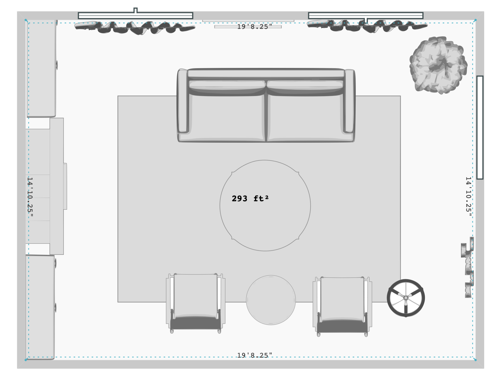
This couple wanted to merge her love for airy, minimalist spaces with his passion for vibrant, bohemian aesthetics. They envisioned a room that felt spacious and serene yet still full of warmth and personality. Although they both agreed on incorporating personal touches, they struggled to find a cohesive balance between the two distinct styles without overwhelming the space. Room. Dimensions: Length: 20 feet, Width: 15 feet, Ceiling Height: 9 feet

Design Approach:

To satisfy this unique design brief, I focused on thoughtful material choices, color harmony, and strategic use of silhouettes. The goal was to infuse personality into the space without overwhelming its minimalist foundation. The result? A perfectly balanced eclectic minimalist living room with subtle bohemian flair.

Color Palette:

The foundation of the design centered on a neutral base to evoke the serene minimalism she appreciated, while incorporating personality and warmth through carefully selected accents. The wall color, Soft Chamois by Benjamin Moore, was chosen for its soft off-white tone with a green undertone, making the space feel both calm and inviting—a perfect backdrop for bolder elements.

Rug & Textiles:

To introduce bohemian flair, I selected a hand-knotted Moroccan rug with abstract patterns inspired by Moroccan heritage. The black and gold rug grounded the room with its rich cultural roots, while still aligning with the minimalist aesthetic through its simple palette. The subtle contrast between the rug and the white quartz coffee table created a playful yet refined tension, essential for an eclectic design.

Shibori throw pillows in deep navy and burnt orange provided artisanal touches, promoting the handmade quality synonymous with bohemian interiors. These bold contrasts added depth and movement to the otherwise clean, neutral sofa, which featured a cream fabric with a pink undertone, offering a soft and welcoming feel.


Furniture:

 The furniture selection balanced form and function with sculptural interest. The minimalist white quartz coffee table with acacia wood legs introduced natural texture while maintaining an elegant presence. The cream sofa, set on deep ash wood legs, invited comfort while keeping a sleek profile. The olive-green accent chair in a mid-century modern design complemented the bohemian elements, while keeping the overall aesthetic grounded in minimalism.

Lighting & Accessories:

Lighting played a crucial role in blending functionality with design. A ceiling fan with a sculptural and fluid design was added, providing soft, diffused light on dimmers while keeping the space comfortable during warm temperatures. Its contemporary style served both aesthetic and practical needs. An arched floor lamp in a brass finish stood next to one of the green accent chairs, contrasting beautifully with the natural abaca material, adding warmth and a subtle bohemian touch.

Window Treatments:

Light-filtering linen drapery, made from European flax in a natural shade with a soft pink undertone, framed the windows. These drapes softened the natural light while adding an organic, airy feel to the room.

 Artwork & Decor:

 To add personality to the walls without overwhelming the space, I chose metal wall décor that featured a fresh take on Picasso’s abstract faces in his signature cubist style. This piece injected artistic flair while keeping with the minimalist tone of the room.

A framed print by Gustav Klimt, featuring serene yellows and cool greens, became a focal point, tying together the earthy tones and enhancing the room's sense of depth and warmth. This deliberate layering of textures, colors, and cultural elements reflected the couple’s love of travel, while maintaining a calm and uncluttered atmosphere.

 This design showcases how thoughtful material selection, strategic layering, and an understanding of both minimalist and bohemian aesthetics can create a cohesive and personalized living space. The result is a spacious, serene, and vibrant room—exactly what the clients envisioned, but couldn’t previously articulate.

 

Previous
Previous

New Traditional, MCM Bedroom: A Perfect Blend of Styles (Case Study)

Next
Next

Industrial Meets Scandinavian Chic in an Open Concept Kitchen & Dining Room: Case Study